[Case 01]
UT Canvas Web Page Redesign
Redesigning the Information Architecture of the UT Austin Canvas landing page and AT@UT page. Improving users’ efficiency in navigating and locating course resources.
Role
UX Designer & Researcher
Team
4 members
Project type
Academic, Information Architecture
Duration
8 Weeks, 2025
Responsibilities
Identified redundancies and break points in the webpage using web crawler tool.
Conducted Card Sorting to understand users’ mental models and redesigned an intuitive labels and navigation system.
Designed high-fidelity prototypes and performed second round card sorting to validate the effectiveness of the new architecture.
Tools/Skills: Figma, Screaming Frog Website Crawler, User Interview, Card Sorting
Define
[Background]
This project originated from the UT Austin Information Architecture course. Our team evaluated the current user experience of Canvas’s landing page and AT@UT page for both students and faculty to identify navigation, labeling, and content issues. The goal was to improve access to learning and teaching resources by enhancing information architecture, clarity, and findability so users can complete key tasks quickly and confidently.
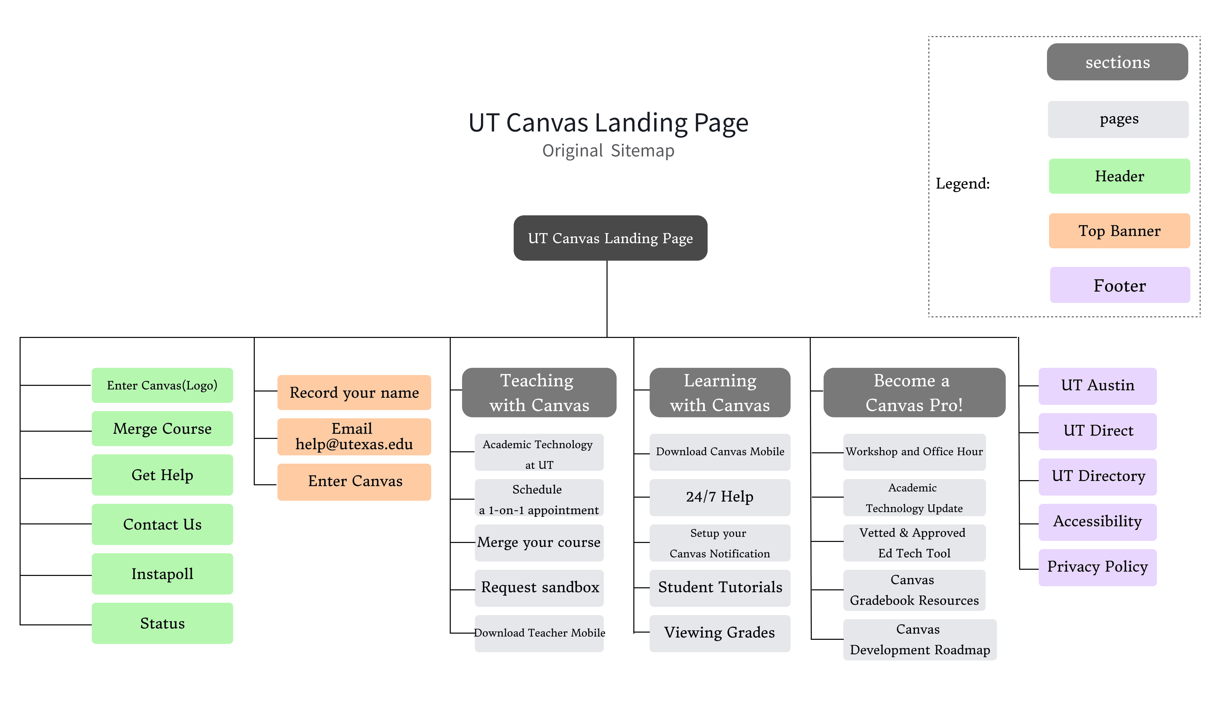
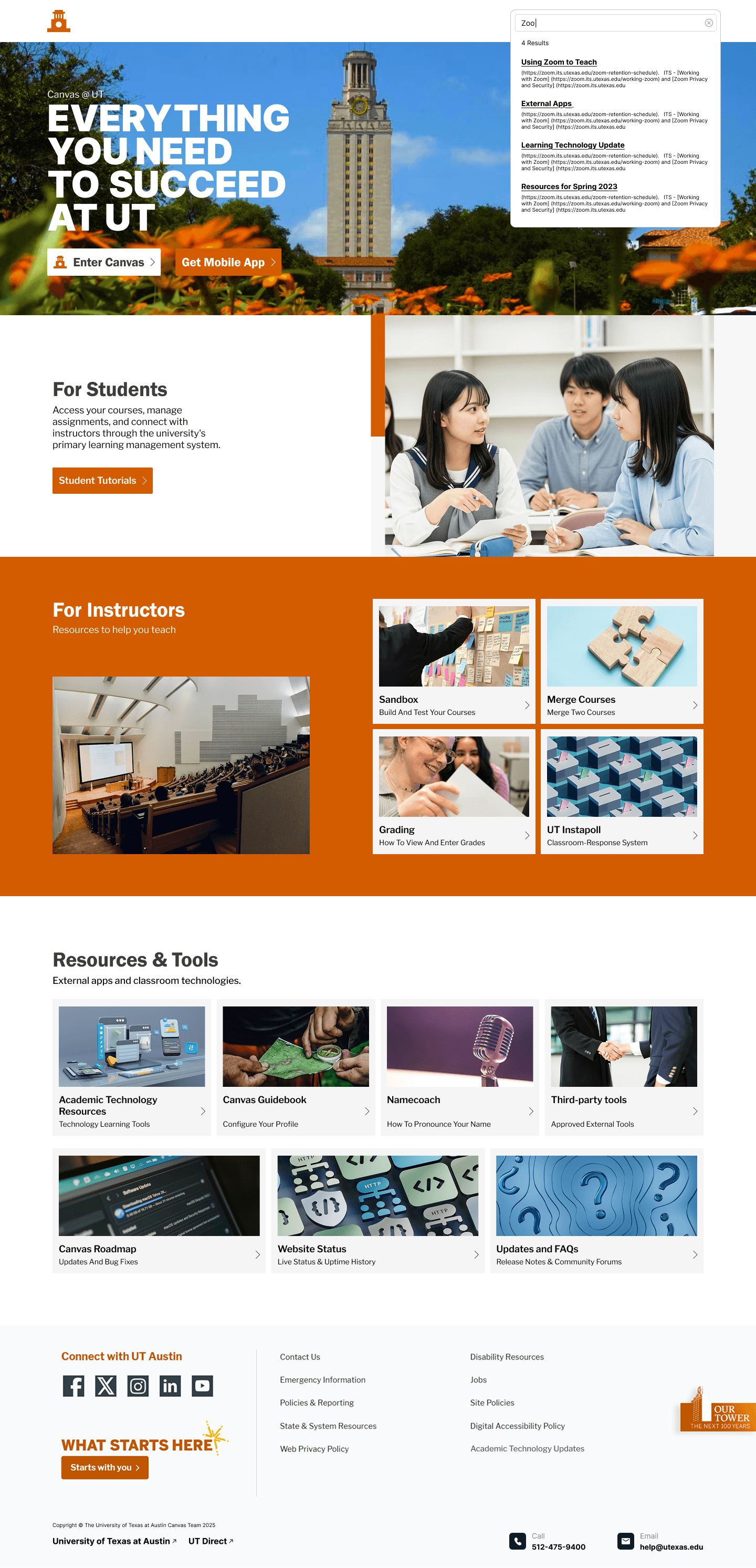
[Current Layout]

[Content Auditory]
We performed a technical crawl of 74 unique pages using Screaming Frog to evaluate the current health of the UT Canvas and AT@UT ecosystem. This comprehensive audit revealed significant structural issues, including several "Under Construction" pages, broken paths, and excessive link duplication where multiple URLs directed users to identical destinations.
[Challenges]
Based on stakeholder interviews and content auditory, the core issues of the current UT Canvas Index and AT@UT pages have been refined into the following four dimensions:
User-Role Disconnect
The current architecture prioritizes faculty needs while neglecting student mental models, creating unnecessary operational friction for students during information retrieval.
Cognitive Overload and Poor Hierarchy
An overloaded layout lacking clear visual priorities causes core functions to be buried in noise, making it difficult for users to identify key tasks quickly.
Labeling Inconsistency
Inconsistent terminology and overlapping functional definitions lead to decision anxiety as users struggle to predict the outcome of their clicks.
Discoverability Friction
Deeply layered navigation and the absence of a global search mechanism force users to browse through multiple directories to reach essential academic resources.
[Problem Statement]
UT Canvas’s faculty-centered design and ambiguous labeling create significant cognitive load, making it difficult for users to efficiently locate resources within a cluttered, deep-layered information architecture.
Ideate
[Card Sorting]
To understand how students and faculty naturally organize information, we conducted an Open Card Sort as our initial research phase. We tested with 11 participants total, including 3 Faculty members and 8 Students. We had every participant run both the Index page and AT@UT card sorts.This round revealed significant disconnects in the current system's logic, evidenced by low categorization agreement—such as a mere 37.5% consistency for items like "Sandbox"—highlighting the urgent need for a more intuitive structure.
[How Might We]
Based on the pain points identified during our audit and research, we defined four core design challenges based on four aspects of Information Architecture:
organization
How might we organize the site to correspond with mental models of faculty and student users?
Search
How might we implement and display a search system that’s easy for users to find and utilize?
Navigation
How might we create a coherent navigational system for quick and effective site usability?
Label
How might we utilize clear, consistent labeling that faculty and student users can easily understand?
Execute
[Sitemap Comparison]


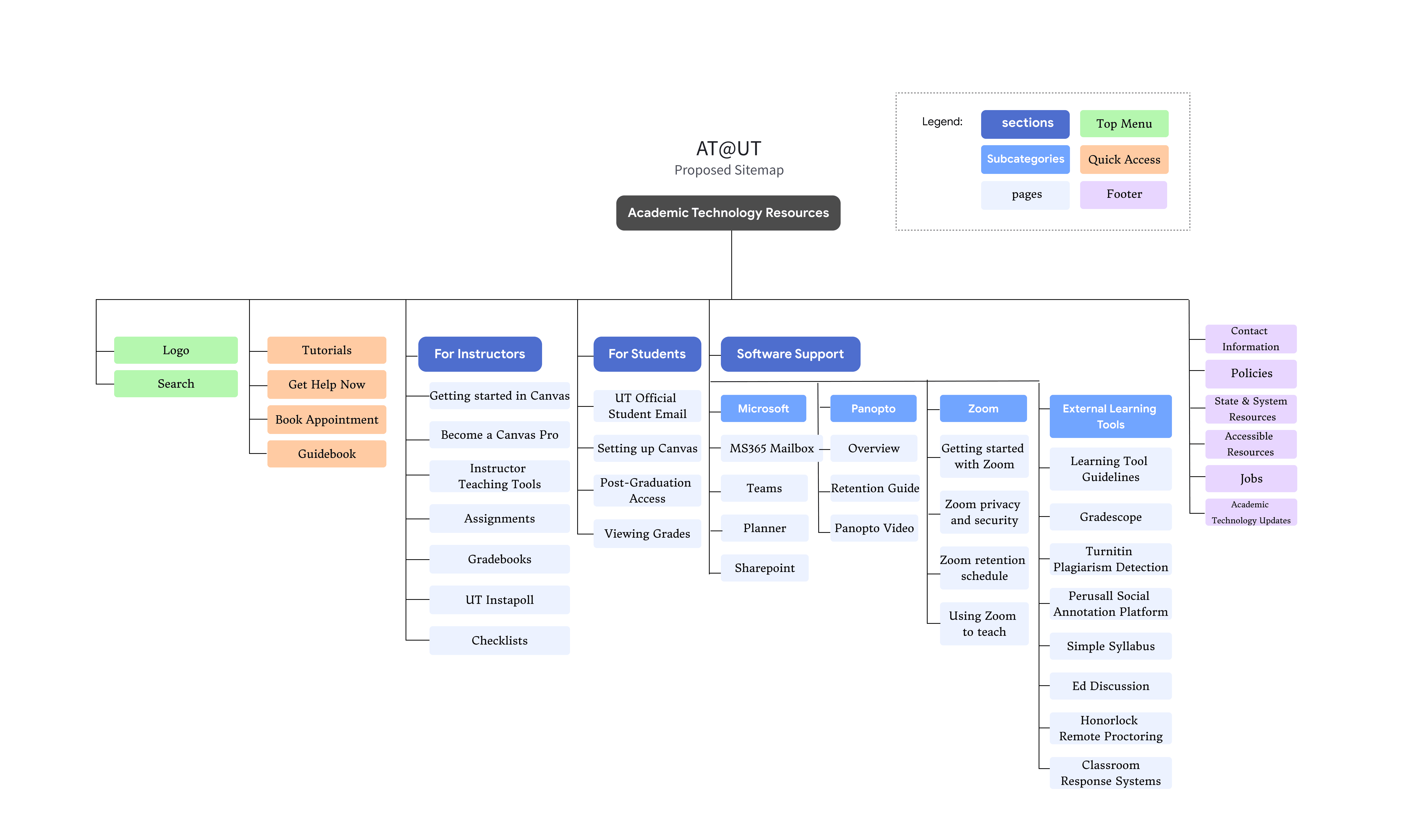
For our new sitemap, we transitioned to a role-based sitemap that clearly organizes content into "For Students," "For Instructors," and universal "Resources and Tools". This flattened hierarchy prioritizes high-frequency tasks—such as search and booking appointments within the header and quick-action sections to eliminate the navigation ambiguity identified in our research. By relegating secondary legal and historical information to the footer, the architecture ensures that essential resources are discoverable and perfectly aligned with user mental models.
[Second Round Card Sorting]
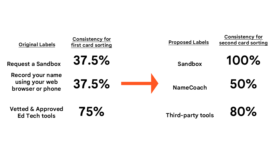
To validate the effectiveness of our proposed structure, we conducted a second round of hybrid card sorting. The results confirmed a dramatic increase in user consensus; most notably, the "Sandbox" category reached a 100% match rate, a significant improvement from the 37.5% agreement seen in the first round.
[Wireframe]

Before committing to high-fidelity details, we developed wireframes to define functional priorities and the structural layout of the new hub. These sketches focused on establishing a "High-Priority Task Area" at the top of the page while providing clear, role-based navigation sections for both students and instructors to minimize cognitive load.
[Prototype]
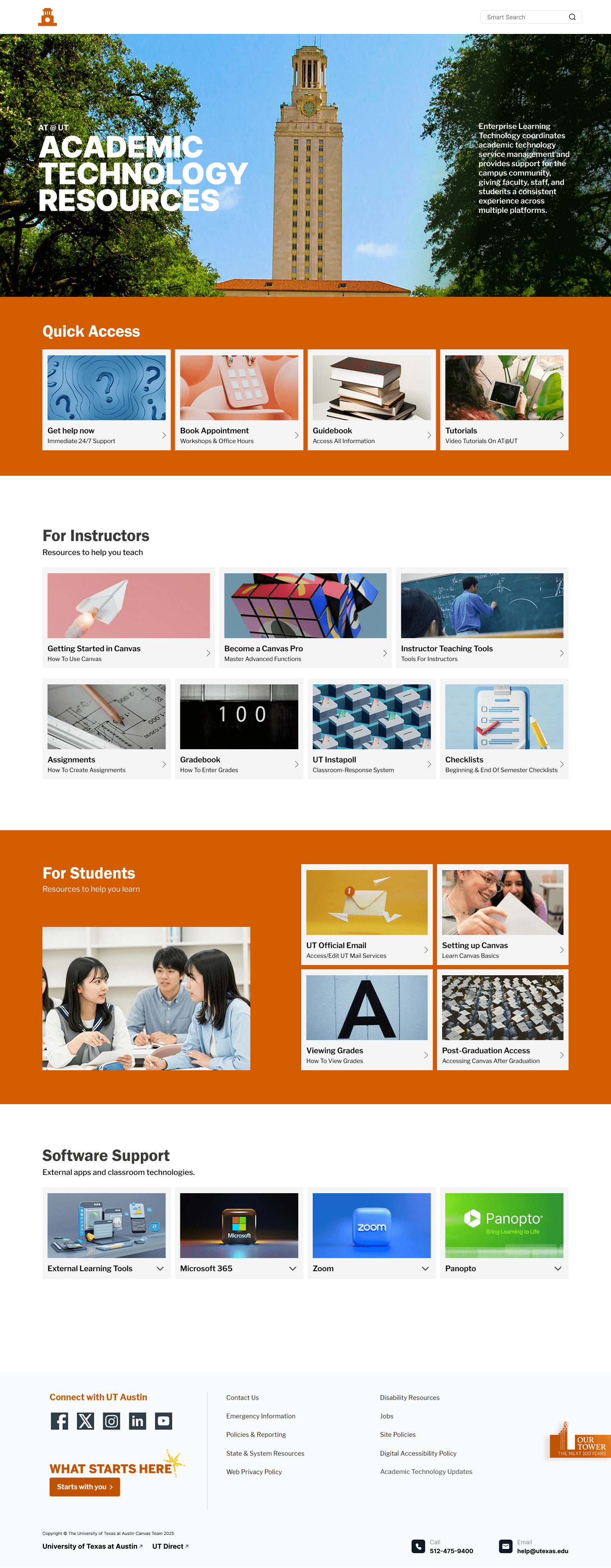
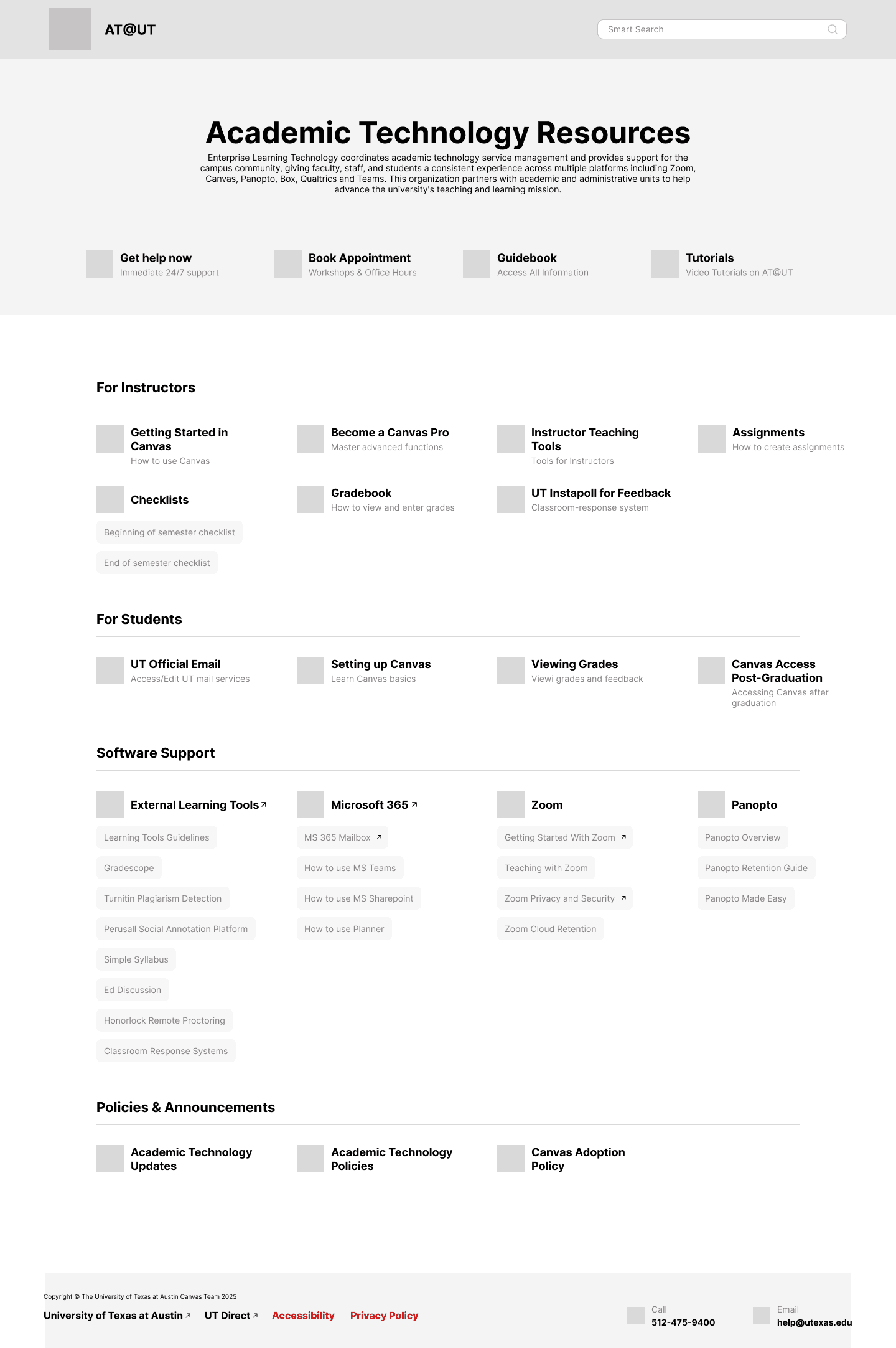
The final "Canvas Resource Hub" employs a modern, tile-based layout to provide a clean and accessible user experience. Strictly adhering to UT Austin’s visual standards of the signature burnt orange color scheme, we created a cohesive interface that functions as a professional and centralized resource gateway.
[Reflection & Next Step]
The most critical lesson I learned is that testing is indispensable to verifying a design's effectiveness. Without it, there is no way to truly measure success. Real user research feedback provides a strong foundation for design decisions, ensuring that choices are grounded in evidence and data rather than mere aesthetics. Moving forward, I aim to implement Tree Testing for further organizational refinement and expand the scope to include mobile optimization and accessibility audits to ensure a high standard of usability for all users.