[Case 02]
KAKAO Webtoon APP Redesign
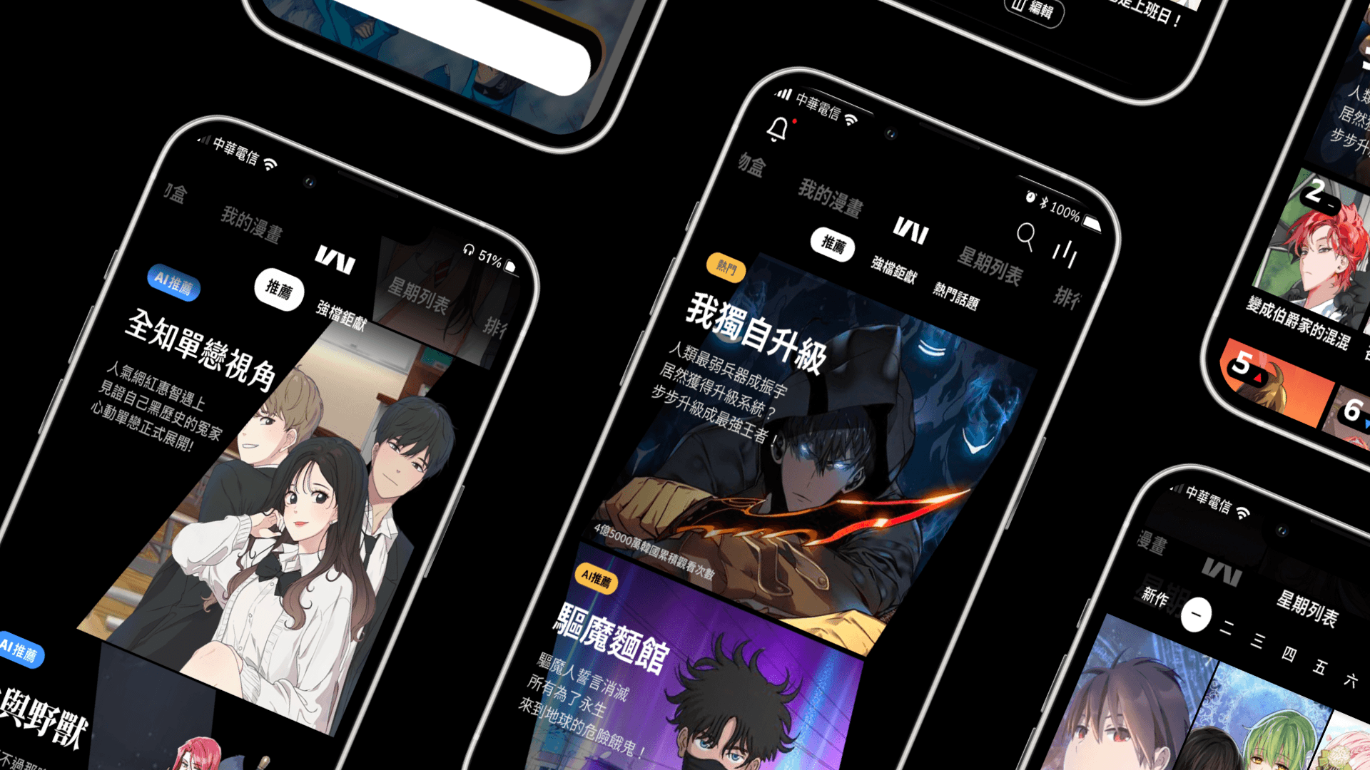
KAKAO WEBTOON is a digital comic platform using a chapter-based payment business model. This project analyzes and redesigns the app based on real-world user frustrations to restore a seamless reading journey.
Role
UX/UI Designer
Team
5 members
Project type
Academic, Service Design, UI Development
Duration
16 Weeks, 2021
Responsibilities
Participated in end-to-end design decisions throughout the project life cycle from initial research to final prototyping.
Co-conducted competitive analysis and user interviews to pinpoint critical immersion breaks and navigation friction.
Established style guide to improve legibility and brand identification.
Mapped user flows and developed interactive high-fidelity prototypes.
Tools/Skills: Figma, Miro, Competitive Analysis, User Interview, Prototyping
Define
[Background]
This project was inspired by real-life frustrations encountered by one of our teammate while using Kakao Webtoon comic application. This redesign addresses the friction between Kakao Webtoon’s high-quality content and its complex interface. Our team aimed to simplify navigation and remove systemic barriers in the payment flow to ensure users can focus entirely on the stories.
[Competitive Analysis]

We analyzed major competitors including LINE Webtoon, ManhuaRen, and MangaToon. While competitors offer streamlined search categorizations and transparent payment confirmations, Kakao Webtoon suffers from excessive visual noise and a lack of transaction verification. Furthermore, unlike rivals that provide flexible reading modes like tap-to-turn, Kakao’s reading function is marred by fragmented navigation and forced gestures that disrupt the immersive experience. These systemic gaps cause Kakao Webtoon to fall short of industry standards, making the interface more cluttered and less intuitive than its peers.
[User Journey Map/Empathy Map]


We analyzed major competitors including LINE Webtoon, ManhuaRen, and MangaToon. While competitors offer streamlined search categorizations and transparent payment confirmations, Kakao Webtoon suffers from excessive visual noise and a lack of transaction verification. Furthermore, unlike rivals that provide flexible reading modes like tap-to-turn, Kakao’s reading function is marred by fragmented navigation and forced gestures that disrupt the immersive experience. These systemic gaps cause Kakao Webtoon to fall short of industry standards, making the interface more cluttered and less intuitive than its peers.
[Problem Statement]
Excessive advertising and fragmented navigation disrupt the user's reading experience and lead to high cognitive load and operational anxiety.
Ideate
[Functional Map]


To resolve identified navigational friction and restore user immersion, we restructured the platform’s functional hierarchy to better align with user mental models. We introduced a dedicated "Events" page to consolidate all promotional content and advertisements that previously cluttered the splash screen and home page. Additionally, we implemented a "Hands-free mode" and a "Swipe/Tap to turn" switch to directly address the diverse reading habits discovered in our research. These targeted interventions correct the previous mismatch between forced gestures and user expectations.
[User Flow]
We translated the functional map into a cohesive wireframe flow. By visualizing the entire journey, we ensured that the transitions between content discovery and the payment system are logical and transparent. We specifically optimized the flow to eliminate accidental ad-triggers, allowing users to reach their favorite comics in fewer steps and with greater confidence.

We replaced intrusive ads that pop-up on the onboarding page with a simple logo animation. The ads were placed in a dedicated “Events hub” page to ensure a content-first experience from the first second.

We added a switch between swipe and tap to turn page that align with diverse user mental models and reduce navigation friction.

A restructured transaction flow with high-contrast confirmation steps to prevent accidental purchases and build user trust.
[Execute]
Design Iterations
Before


After
Relocated promotional event ads from the homepage to a dedicated "Events Hub," prioritizing recommended comics to reduce visual noise and user confusion.
Before


After
Implemented a function that allow users to switch between tap or swipe to turn pages, , ensuring a more personalized and comfortable reading experience.
Before


After
Optimized contrast with gold-on-black text and centered payment confirmations for better visibility and user trust.
[Style Guide]


[Visual Language: Quiet Luxury]
We change the design from a chaotic neon palette to a refined black and gold system, where the deep black foundation ensures maximum immersion for the reader while gold strategically highlights transactional elements to establish a sense of value and trust. To resolve the "ambiguous icon" pain points identified during research, the icon set was redesigned with a unified stroke-weight and clearer visual metaphors, ensuring that every functional element is instantly recognizable and intuitive.
[Prototype]
View Figma Prototype (Chinese)
[Reflection & Next Step]
This project reinforced that design is a conversation that should not end prematurely, as without continuous validation, even the most thoughtful solutions remain hypotheses rather than proven results. It also highlighted the complex challenge of balancing user immersion with business sustainability, particularly when consolidating ads into a dedicated hub to reconcile a seamless experience with the company’s bottom line. To move beyond intuition, the next phase will involve conducting moderated usability testing with 10+ active readers to validate the new navigation flow and achieve a 90% task success rate.